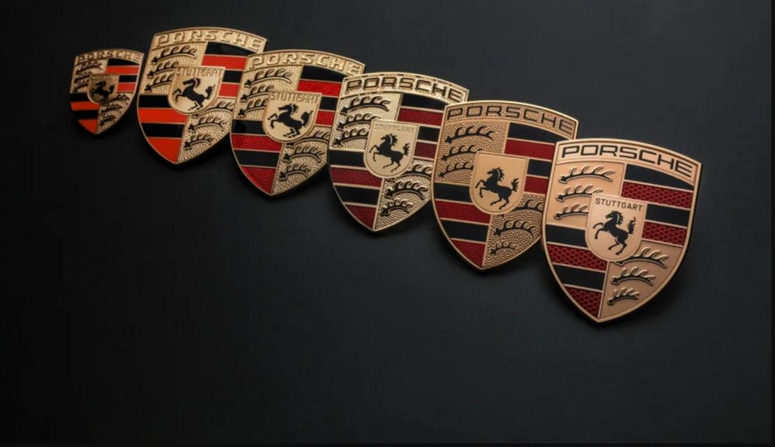
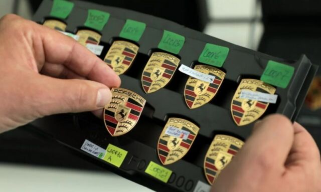
For the first time in 15 years, Porsche modernizes its crest in the brand’s 75th anniversary year.
This is the sixth update of the company’s logo since 1952, reshaping every detail to create the logo in the age of electrification.
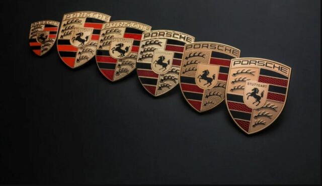
The differences between the modernized Porsche crest and its immediate predecessor, are:
Brushed precious metal, three-dimensional honeycomb structure, refreshed crest animal, and more subtle gold color.
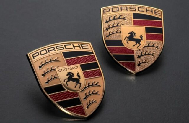
In a three-year process and with great attention to detail, the designers of Style Porsche along with marketing experts, have modernized the iconic logo.
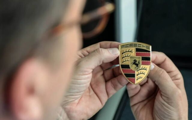
Michael Mauer, Vice President Style Porsche, said:
“The ‘75 years of Porsche sports cars’ anniversary was the occasion for us to rework this trademark. With its cleaner and more state-of-the-art execution, the refined crest communicates the character of Porsche. We have reinterpreted historical characteristics and combined them with innovative design elements such as a honeycomb structure and brushed metal. The result is an aesthetically ambitious arc that bridges the history and the future of the brand.”
The introduction will start on the vehicle side at the end of 2023.
Images credit Porsche
source Porsche
