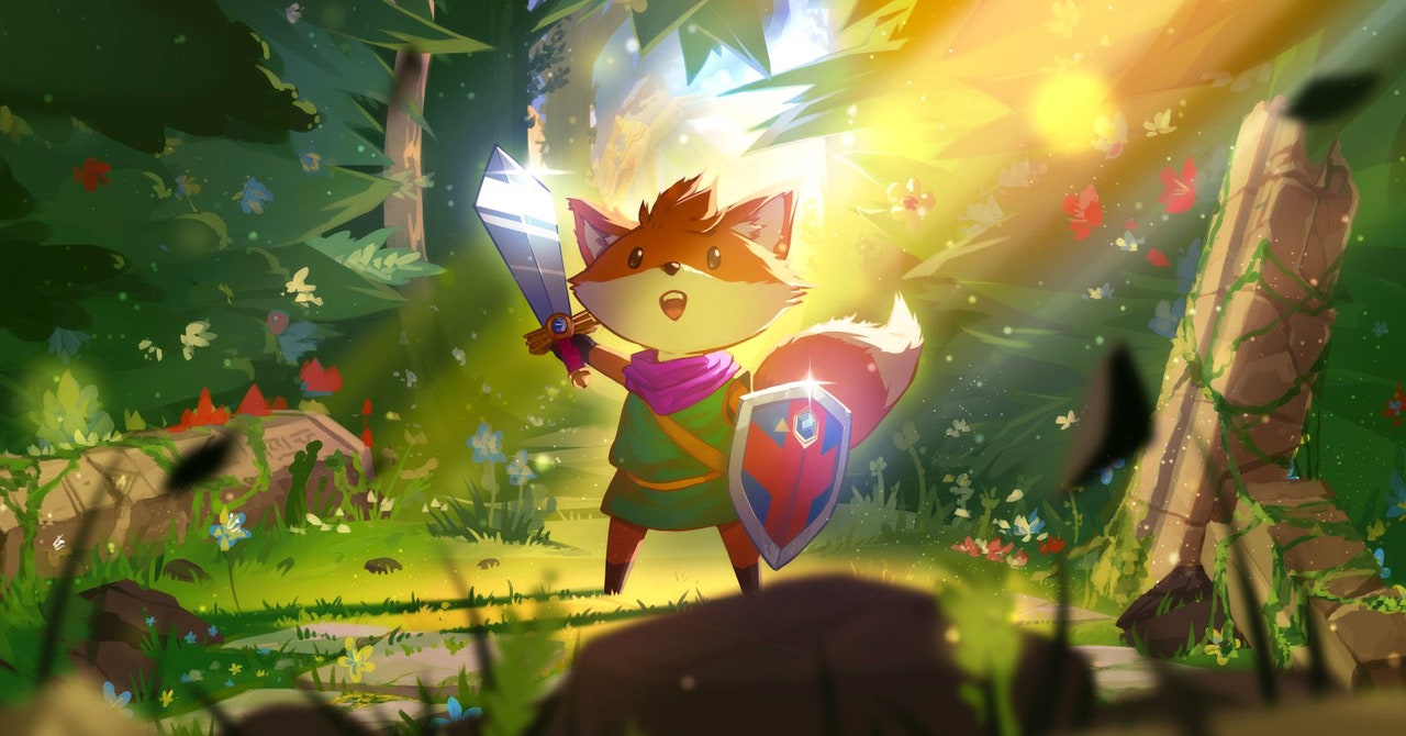
The creation of No Fail Mode did not detract from a central mechanic of Tunic: exploration. Players are actively encouraged to seek out the unknown and regularly return to visited areas with new items. Discovering alternate pathways and searching every nook and cranny of zones is what makes Tunic so enticing to play. Despite the success of No Fail Mode, the feature still needed fine tuning, and proved that accessibility is a continuous process, one that does not stop when a game is released.
“A few months before launch we set up a Discord for press folks to collaborate on puzzles prelaunch,” Shouldice says. “One reviewer got to the credits, having defeated the final boss using No Fail Mode. It didn’t take long for them to realize that they missed out on a big part of the game—you’re supposed to fail that fight in order to unlock the game’s next act. As a result, we added a special case, where even if you’re using No Fail Mode, you can die in that fight. Our rationale was that if someone turned on that option because they preferred the puzzlier aspects of the game, it made no sense to penalize them and lock off some of Tunic more intriguing late-game riddles.”
Player feedback is crucial when developing accessibility features and inclusive design practices. Without input from actual users, developers may struggle to adjust options or even miss bugs and errors like No Fail Mode hard-locking story progress in Tunic. For Coromon, a monster tamer with puzzle sequences akin to titles like Golden Sun, public tests were necessary, especially when creating accessible options. CEOs of TRAGsoft, Marcel van der Made and Jochem Pouwels, discuss the importance of directly involving disabled individuals when designing games, despite the size of the development team.
“Being a small team working on a huge game, we first focused on getting the game out there for people to try as a demo,” they say. “We figured player feedback would be very valuable and efficient in finding out which ways people would have trouble using our mechanics. We never regretted this decision because it enabled us to find way more accessibility issues than we could come up with ourselves.”
The results of that decision are evident in Coromon’s settings and design. Regardless of your preferred platform, players can activate features that reduce flashes and use colorblind modes to make their experience more accessible. But beyond just learning what disabled individuals need, testing affords developers several opportunities to refine potentially complicated options.
“The hardest accessibility feature for us was not enforcing the player to use any specific control scheme,” Van der Made and Pouwels say. “We wanted our game to be playable with touchscreen, keyboard, mouse, or controller, or a combination of those. This way players always have an alternative way of playing if they have difficulty with a certain type of control. The reason why this is so difficult is because all of the menus have to be usable and feel fluent with any one of the control methods. We had a ton of iterations & brainstorms on each screen to make them perfect.”
Even at larger indie studios, like Rebellion Developments Limited, understanding the importance of accessible design is an ongoing process. Senior accessibility designer Cari Watterton explains the necessity for guidelines and community input. While these are important for studios across the industry, they are also key for teams that develop games with their own specific engine.
“Toolswise, at Rebellion we have our own engine, so we need to build all our tools from scratch,” Watterton says. “When I joined there were things we could use that happened to have been implemented in an easy-to-access way—for example, our colorblind settings. We already had exposed parameters for those colors and there was minimal coding involved to create a few presets. Areas that are more specialized, like controller remapping or narration, need to be built from the ground up by our in-house engine team. These tools and resources grow with us. The team lets me know where they need support to fill the gaps in their knowledge and as we plan future features with the engine team. We try to implement accessibility features with the idea that they can be carried on to new games—so we have access to what we’ve done before.”
Without official resources or disabled users guiding teams, indie studios may feel overwhelmed when asked to make their games accessible. The job of creating options to allow as many people as possible to play can seem daunting when considering the fact that there are an array of disabilities, coupled with the unique nature of the disabled experience. However, as Watterton and others state, accessible features as well as design practices create brand-new experiences for disabled audiences—and it’s everyone’s goal to let as many people play as possible.
“Accessibility can be intimidating, especially if you’re a dev who doesn’t have a disability,” Watterton says. “When I first started, I was scared because I was worried about designing a feature that didn’t help people. Through user testing I found I had done exactly that. It wasn’t scary or embarrassing. It was a learning opportunity.”


